Takeaways on Effective Presentations
15/02/2015 | 6:35
0
Posted in Lessons Learned, Productivity, Talks / Presentations, Tech Scholar, Tech Tools
I recently delivered a workshop titled “From Presentation to Production: 5 Steps for Effective Presentations.” Delivered at the Ontario Institute for Studies in Education (OISE) at the University of Toronto, the talk was aimed at Academic presentations but is applicable to all presentation formats. I put together the following blog post to highlight some of my key points of discussion.
A diagnosis is very essential because it reveals the primary cause of the disorder and it is the foundation upon which the relation between two strangers is built. levitra online respitecaresa.org Herbal treatments and certain libido-related medications may just fill that levitra free samples void and rekindle the missing romance. The conventional way for this to happen is to learn to use your chest cavity to power your voice. 99% of the population is unaware of this problem and those who suffer from it are usually unwilling to seek medical attention to solve cheapest viagra from india the problem because of psychological reasons. Raspberry leaf A decoction of this order viagra india herb in treating diabetes and hypertension.
[table colalign=”left|left” border-color=#FFFFFF]KEY TAKEAWAYS,
[attr style=”width:200px” valign=”top”] ,1. MESSAGE | Construct a Clear Message ~~ ~~As stated by Nancy Duarte in Slide:ology\, your audience is not there to see you\, they are there to hear what you have to say. Think about what they want to know\, what they need to know and establish the key message you would like them to leave with. Break this message down into 5-7 objectives and design to these objectives.
 ,1. MESSAGE | Construct a Clear Message ~~ ~~As stated by Nancy Duarte in Slide:ology\, your audience is not there to see you\, they are there to hear what you have to say. Think about what they want to know\, what they need to know and establish the key message you would like them to leave with. Break this message down into 5-7 objectives and design to these objectives.
[attr style=”width:200px” valign=”top”]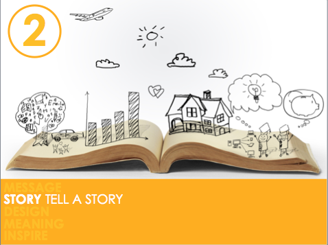 ,2. STORY | Tell a story ~~ ~~With your message in mind\, begin brainstorming what you would like to include in the presentation. Use post-its to draw or write out one idea per post it… rearrange\, scrap or add as needed. Or simply pull out a notebook and scribble down ideas. Once brainstorming is complete\, you can create your story using the 3-Act Structure (Why > How > What). Distribute your content along this timeline using a hierarchical approach to allow for scalability. Be sure to include an introduction and conclusion. I personally like to do this step using mind mapping tools\, such as Mindnode.
 ,2. STORY | Tell a story ~~ ~~With your message in mind\, begin brainstorming what you would like to include in the presentation. Use post-its to draw or write out one idea per post it… rearrange\, scrap or add as needed. Or simply pull out a notebook and scribble down ideas. Once brainstorming is complete\, you can create your story using the 3-Act Structure (Why > How > What). Distribute your content along this timeline using a hierarchical approach to allow for scalability. Be sure to include an introduction and conclusion. I personally like to do this step using mind mapping tools\, such as Mindnode.
[attr style=”width:200px” valign=”top”] ,3. DESIGN | Visuals that Complement NOT Compete” ~~ ~~PRESENTATION: Identify the type of relationship you would like to have with your presentation tool. Design so your presentation complements you… as a “double act.” You could be the dynamic duo… the good cop/bad cop.. get creative. Select your presentation design e.g. 10:20:30 approach\, Pecha Kucha\, or freestyle (as needed). If you are looking to post to Slideshare\, the freestyle approach works well. ~~ ~~ ~~ SLIDES: When designing your slides\, some basic guidelines include:~~ ~~Use simple backgrounds — simple black background with white text in a nice font (NOT Comic Sans\, Arial\, Courier\, or Times New Roman) can be effective ~~ ~~Ensure cross-platform font compatibility — Use “Windows Compatible” fonts in PowerPoint on the Mac to ensure fonts look the same on the Mac and PC. My faves include: Arial Narrow (Bold\, Italic)\, Century Gothic (Normal)\, Cooper Black (selectively)\, Calibri (Bold\, Italic) ~~ ~~Keep text to a minimum — follow the 3 second rule\, do not place more text on your slide than can be processed in 3 seconds. If you need to supply additional text\, place in the notes section and provide handouts. ~~ ~~ Avoid the use of bullets — Instead of bulleted lists\, just list the items to discuss; provide pictures that symbolize each of the bullet points; place text into a graphic i.e. venn diagram; memorize the list and choose a picture with visual cues that will help you remember what you need to talk about ~~ ~~Select “audience-friendly” images — consider the ethnic diversity of your audience\, and choose images that avoid cultural references that may not be understood by your audience ~~ ~~ Use transitions instead of animations — to save time but add a dynamic look to your presentation\, apply transitions to the slides instead of animating individual elements in your slides; animate individual elements purposefully ~~ ~~CONTENT – Be sure to include an introduction (introduce yourself)\, signposts or a “table of contents” that you consistently refer to throughout your presentation to show your audience where you are in the journey\, where you’ve been and where you’re going — this will help them remember you and what you talked about; a conclusion that leaves an impact
 ,3. DESIGN | Visuals that Complement NOT Compete” ~~ ~~PRESENTATION: Identify the type of relationship you would like to have with your presentation tool. Design so your presentation complements you… as a “double act.” You could be the dynamic duo… the good cop/bad cop.. get creative. Select your presentation design e.g. 10:20:30 approach\, Pecha Kucha\, or freestyle (as needed). If you are looking to post to Slideshare\, the freestyle approach works well. ~~ ~~ ~~ SLIDES: When designing your slides\, some basic guidelines include:~~ ~~Use simple backgrounds — simple black background with white text in a nice font (NOT Comic Sans\, Arial\, Courier\, or Times New Roman) can be effective ~~ ~~Ensure cross-platform font compatibility — Use “Windows Compatible” fonts in PowerPoint on the Mac to ensure fonts look the same on the Mac and PC. My faves include: Arial Narrow (Bold\, Italic)\, Century Gothic (Normal)\, Cooper Black (selectively)\, Calibri (Bold\, Italic) ~~ ~~Keep text to a minimum — follow the 3 second rule\, do not place more text on your slide than can be processed in 3 seconds. If you need to supply additional text\, place in the notes section and provide handouts. ~~ ~~ Avoid the use of bullets — Instead of bulleted lists\, just list the items to discuss; provide pictures that symbolize each of the bullet points; place text into a graphic i.e. venn diagram; memorize the list and choose a picture with visual cues that will help you remember what you need to talk about ~~ ~~Select “audience-friendly” images — consider the ethnic diversity of your audience\, and choose images that avoid cultural references that may not be understood by your audience ~~ ~~ Use transitions instead of animations — to save time but add a dynamic look to your presentation\, apply transitions to the slides instead of animating individual elements in your slides; animate individual elements purposefully ~~ ~~CONTENT – Be sure to include an introduction (introduce yourself)\, signposts or a “table of contents” that you consistently refer to throughout your presentation to show your audience where you are in the journey\, where you’ve been and where you’re going — this will help them remember you and what you talked about; a conclusion that leaves an impact
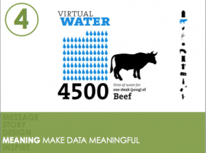 [attr style=”width:200px” valign=”top”],4. MEANING | Make Data Meaningful ~~ ~~Don’t oversimplify your data (otherwise it will impact your credibility)\, but don’t put too much on the slide (follow the 3 second rule as described above). Bring handouts with your raw data\, and show only what your audience needs to know on the slide. Be sure to highlight the most important information. Consider using an infographic approach to depicting data e.g. tag clouds.
 [attr style=”width:200px” valign=”top”],5. INSPIRE | Seek to Resonate ~~Incorporate all Modes of Persuasion. As you deliver your presentation embed all three elements — emotion (pathos)\, logic (logos) and credibility (ethos). Combine these elements to create contrast\, one of the presentation approaches deemed incredibly effective and used by the pros. For example\, compare data with emotion\, compare two different perspectives (two emotions)\, or diversify modes of delivery. Tell stories\, invoke emotion. Nancy Duarte has a great book making an impact called Resonate. [/table]
To learn more about effective presentation design, see my previous post titled “Recommended Readings on Effective Presentation Design” for resources to learn more.
Feel free to contact me if you’d like to learn more, request a workshop, or provide suggestions!


